![]() BRAND IDENTITY ROUND 1
BRAND IDENTITY ROUND 1
![]() IDENTITY STYLESCAPE 1
IDENTITY STYLESCAPE 1
[1-A]
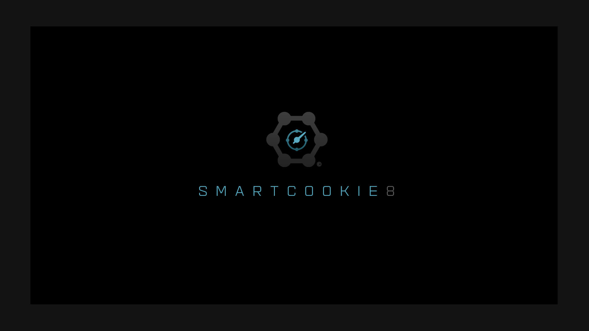
Identity Mark
![]()
Identity mark 1A consists of two primary elements: a speedometer needle that communicates the car-related focus of Smartcookie, in addition to the ranking system, as well as a ring of nodes that represent the connective nature of the website – connecting car enthusiasts with information, ratings, purchases and other car lovers.
![]()
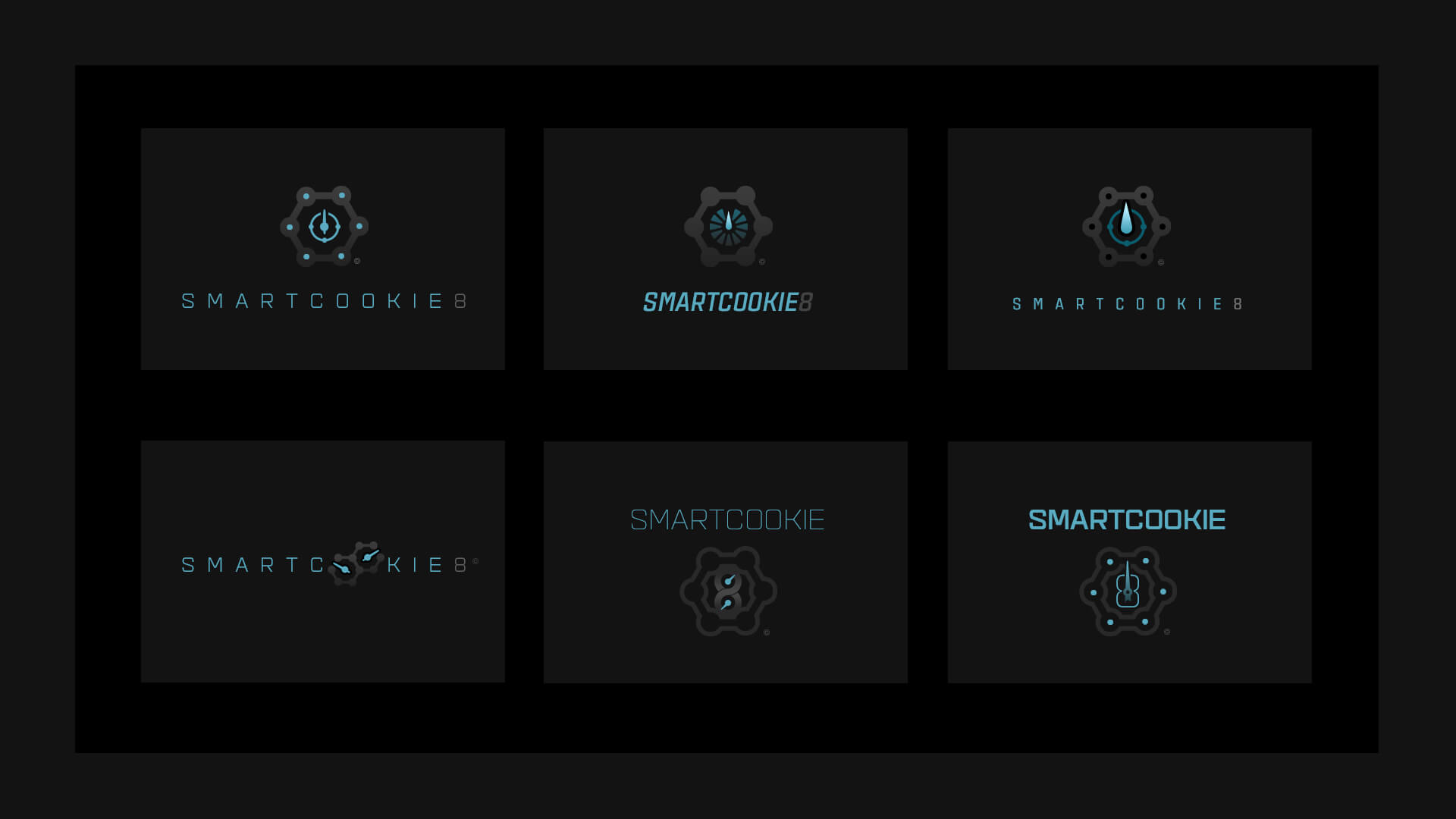
[1-B]
Identity Mark Iterations
The following set of iterated marks shows several different explorations of this identity approach that share similar elements or a common theme.
![]()
[1-C]
Brand Mark Elements
The elements that compose the identity mark are broken down into concept keywords that aim to fulfil the communication of a particular key idea. Additionally it illustrates a monochromatic and reverse-color representation of the identity.
![]()

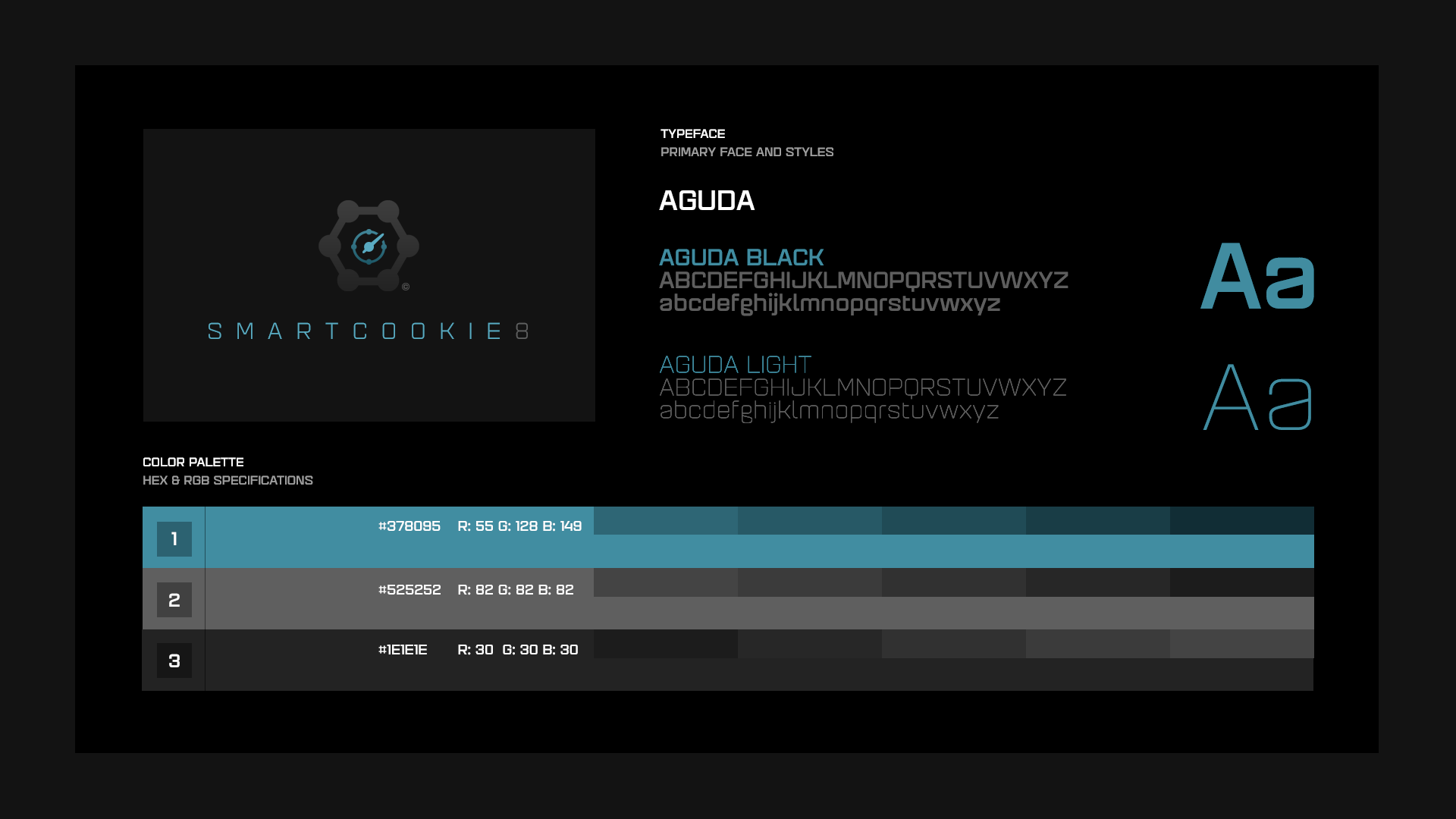
[1-D]
Color & Typographical Specifications
Color palette & primary / secondary font usage are outlined.
![]()
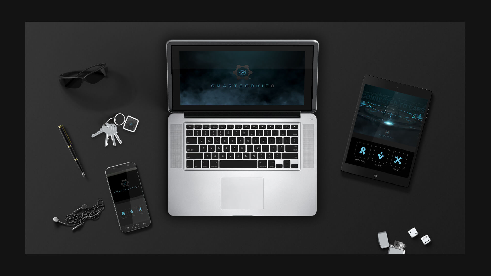
[1-E]
Brand Components
Explorations of the identity within the context of digital devices are portrayed.
![]()
[1-F]
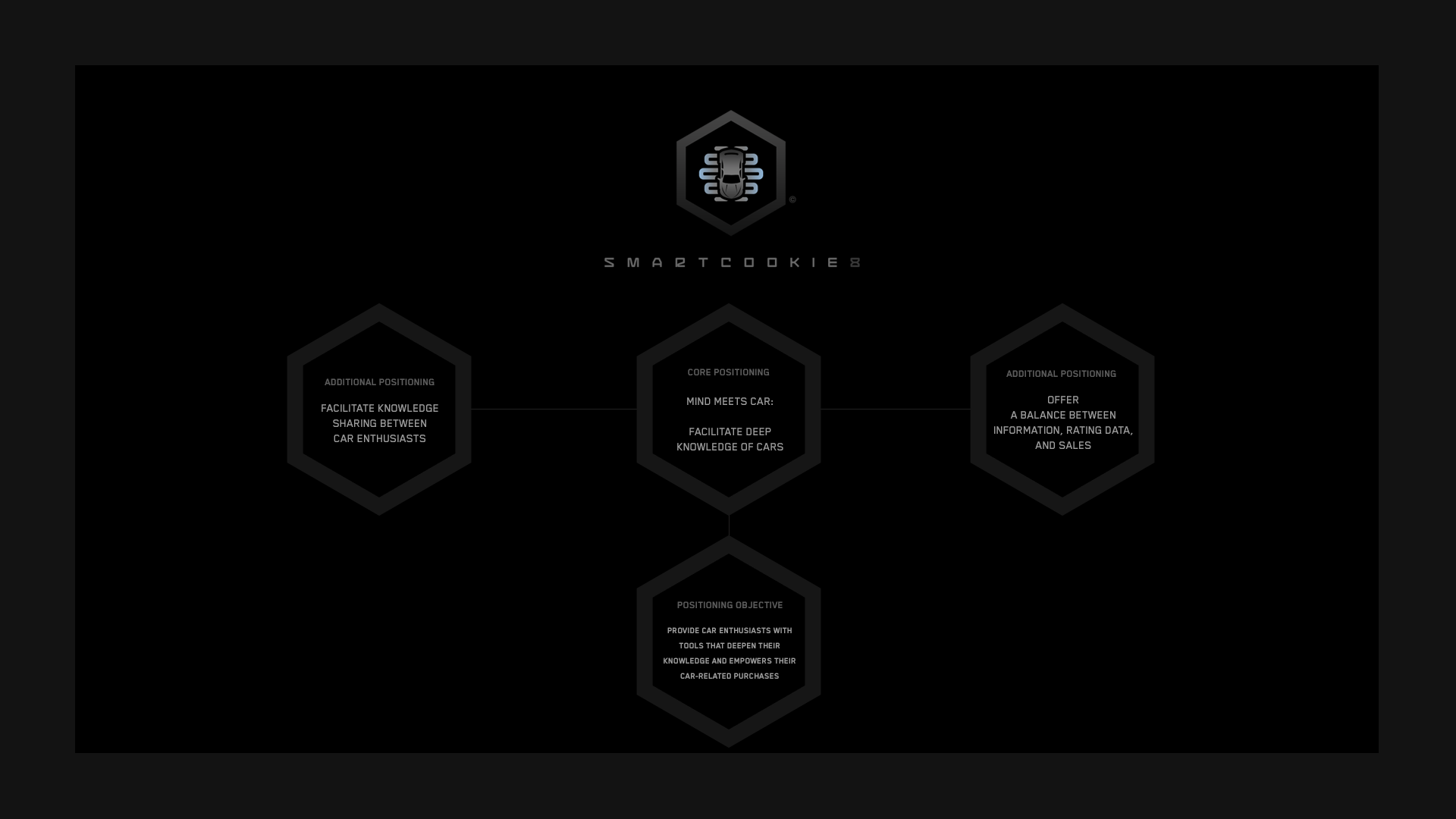
Brand Mark Strategy
The core position and positioning objective combine to drive every element of the identity design:
![]()

[1-G]
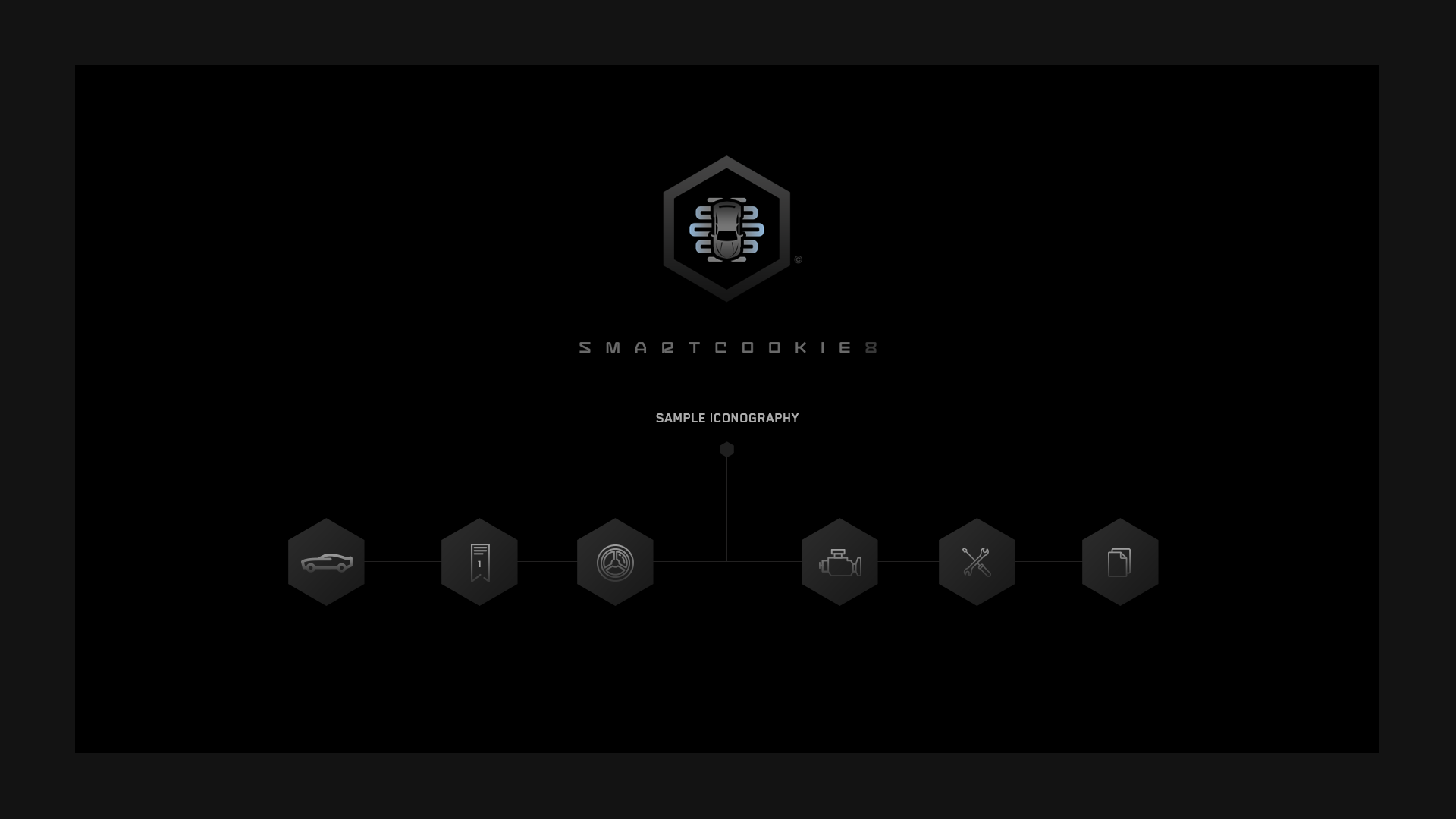
Sample Iconography
A system of icons will strengthen the communication level of the overall brand.
![]()

[1-H]
Styleframe 1
The following styleframe explores connecting a wireframe representation of the identity mark and tying it into the iconography system.
![]()

[1-I]
Styleframe 2
Styleframe 2 illustrates an experimental 3D representation of the identity mark.
![]()

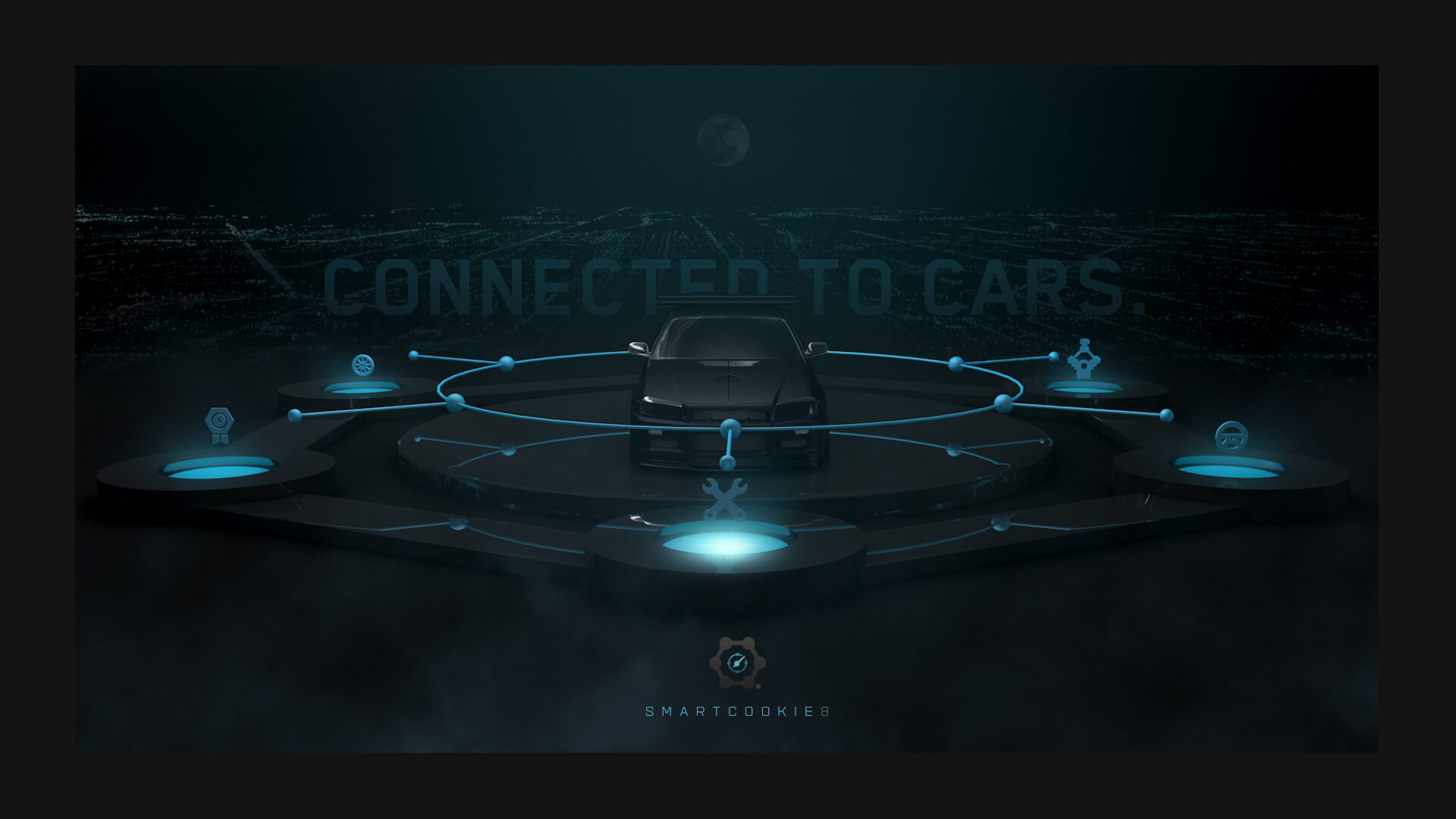
[1-J]
Styleframe 3
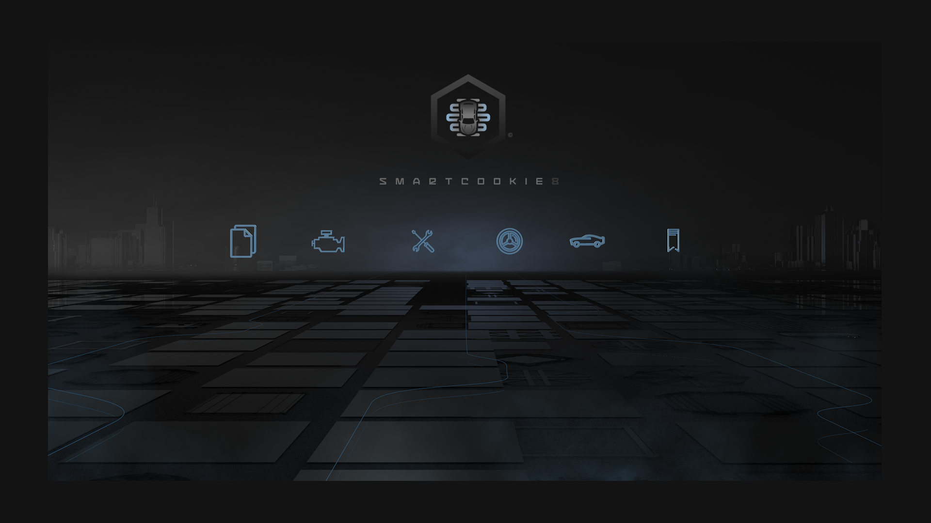
Styleframe 3 is intended to showcase the use of the iconography in tandem with generically stylized cars, in a striking environment.
![]()
![]() IDENTITY STYLESCAPE 2
IDENTITY STYLESCAPE 2
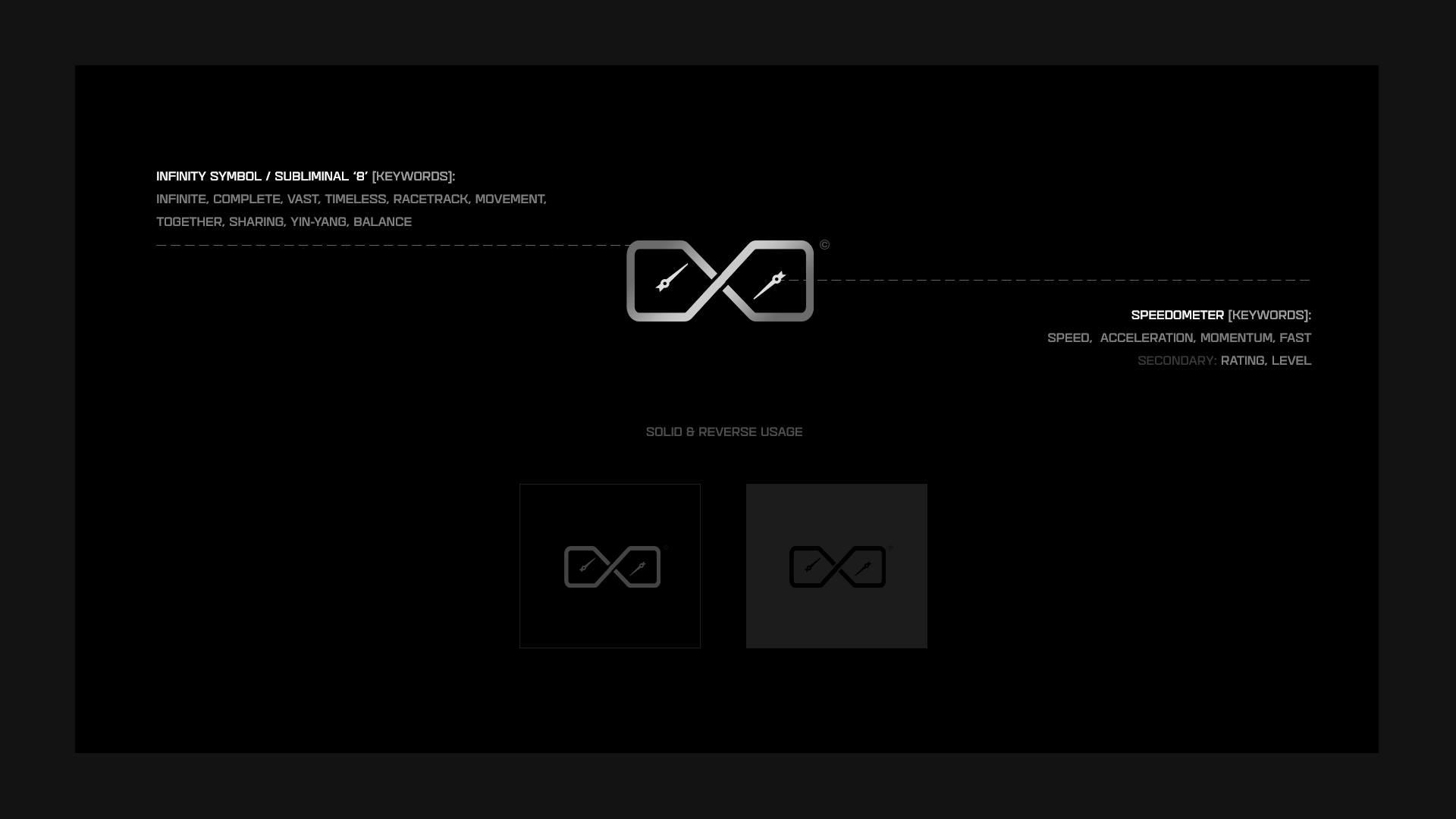
[2-A]
Identity Mark
![]()
Identity mark 2A revolves around the use of an infinity loop, which also represents the “8” in the SmartCookie8 domain name. The infinity loop is powerful symbol that communicates many ideas, but also appears to resemble a racing track. Dual speedometer needles reinforce the central focus on cars, acceleration, and rankings. Subliminally, the dual needles also communicate the idea of car enthusiasts sharing information, within the context of the infinite “8” loop.
![]()
![]()
[2-B]
Identity Mark Iterations
The following set of iterated marks shows several different explorations of this identity approach that share similar elements or a common theme.
![]()
[2-C]
Brand Mark Elements
The elements that compose the identity mark are broken down into concept keywords that aim to fulfil the communication of a particular key idea. Additionally it illustrates a monochromatic and reverse-color representation of the identity.
![]()
[2-D]
Color & Typographical Specifications
Color palette & primary / secondary font usage are outlined.
![]()

[2-E]
Brand Components
Explorations of the identity within the context of digital devices are portrayed.
![]()

[2-F]
Brand Mark Strategy
The core position and positioning objective combine to drive every element of the identity design:
![]()

[2-G]
Sample Iconography
A system of icons will strengthen the communication level of the overall brand.
![]()

[2-H]
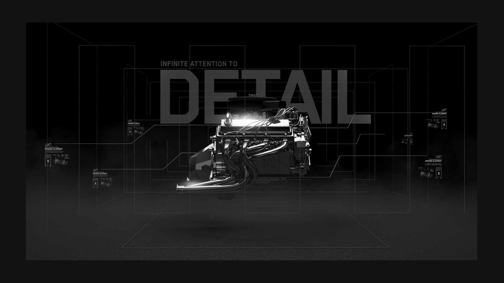
Styleframe 1
Styleframe 1 illustrates and experimental approach to the brand aesthetic.
![]()

[2-I]
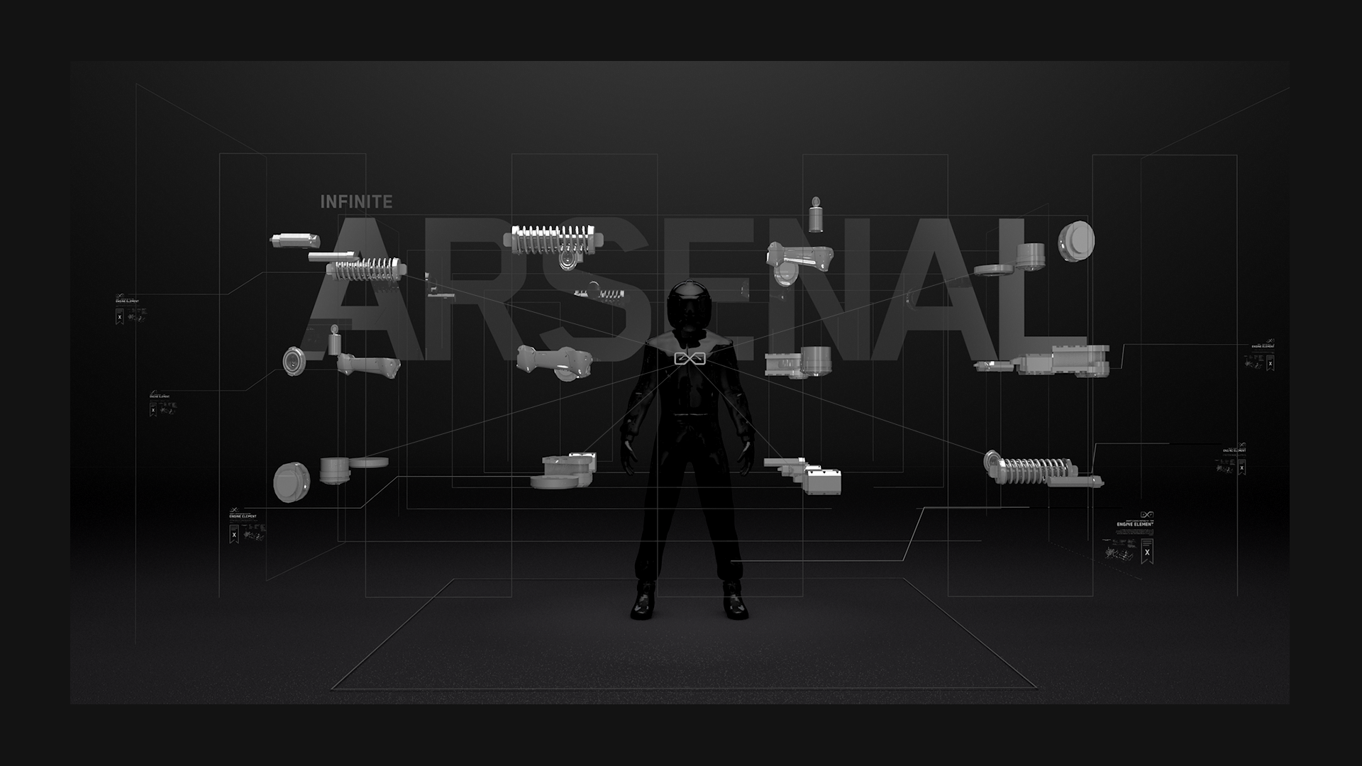
Styleframe 2
Styleframe 2 illustrates another experimental approach to the brand aesthetic.
![]()
[2-J]
Styleframe 3
Styleframe 3 illustrates another experimental approach the brand aesthetic.
![]()
![]() IDENTITY – FINAL MARK OPTIONS
IDENTITY – FINAL MARK OPTIONS
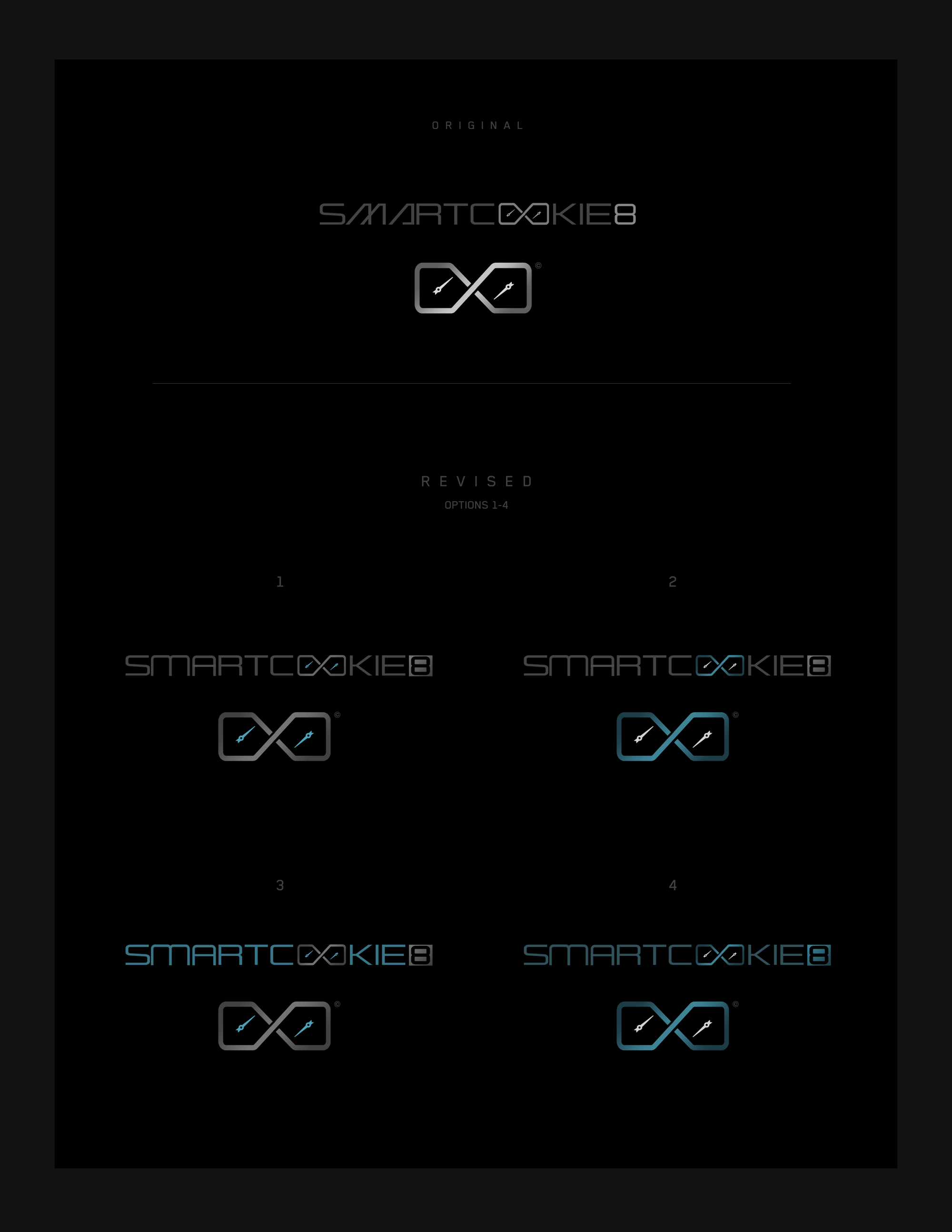
[Final Mark Options 1-4]![]()
![]()
![]() IDENTITY STYLESCAPE 3
IDENTITY STYLESCAPE 3
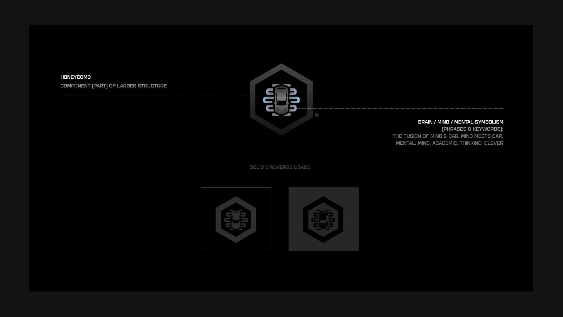
[3-A]
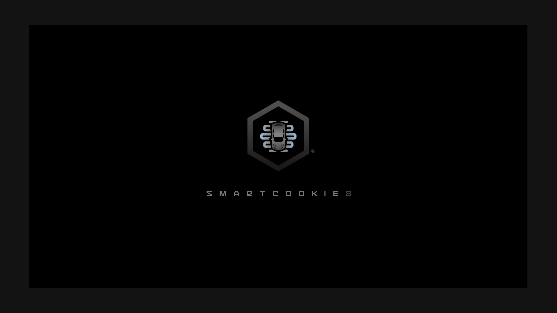
Identity Mark
![]()
Identity mark 3A intertwines a car body with subtle brain & mental symbolism to convey the mindset of the car lover, as well as the desire to gather more knowledge about cars.
![]()
[3-B]
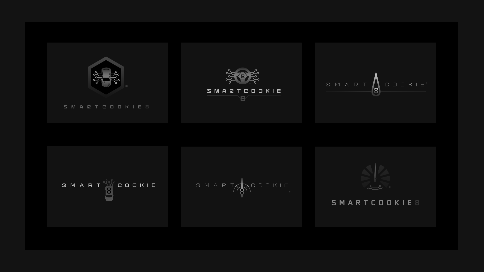
Identity Mark Iterations
The following set of iterated marks shows several different explorations of this identity approach that share similar elements or a common theme.
![]()
[3-C]
Brand Mark Elements
The elements that compose the identity mark are broken down into concept keywords that aim to fulfil the communication of a particular key idea. Additionally it illustrates a monochromatic and reverse-color representation of the identity.
![]()
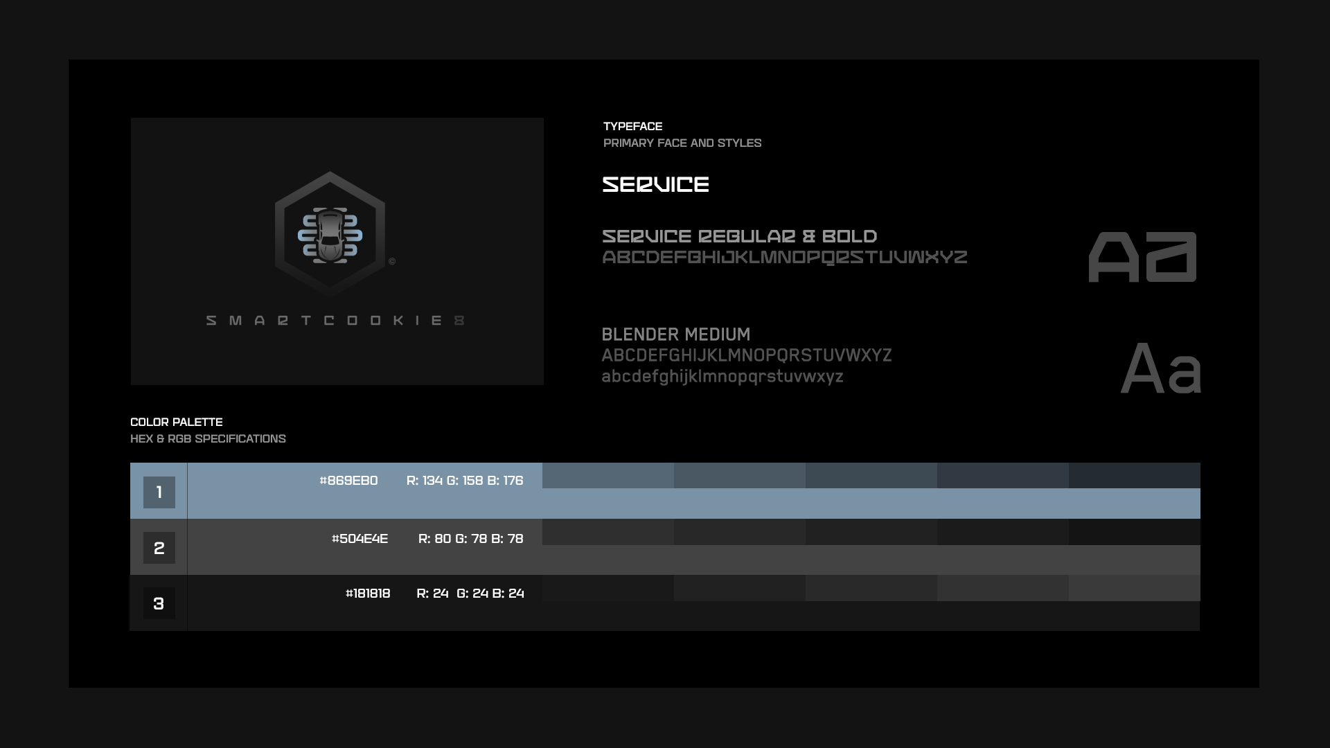
[3-D]
Color & Typographical Specifications
Color palette & primary / secondary font usage are outlined.
![]()
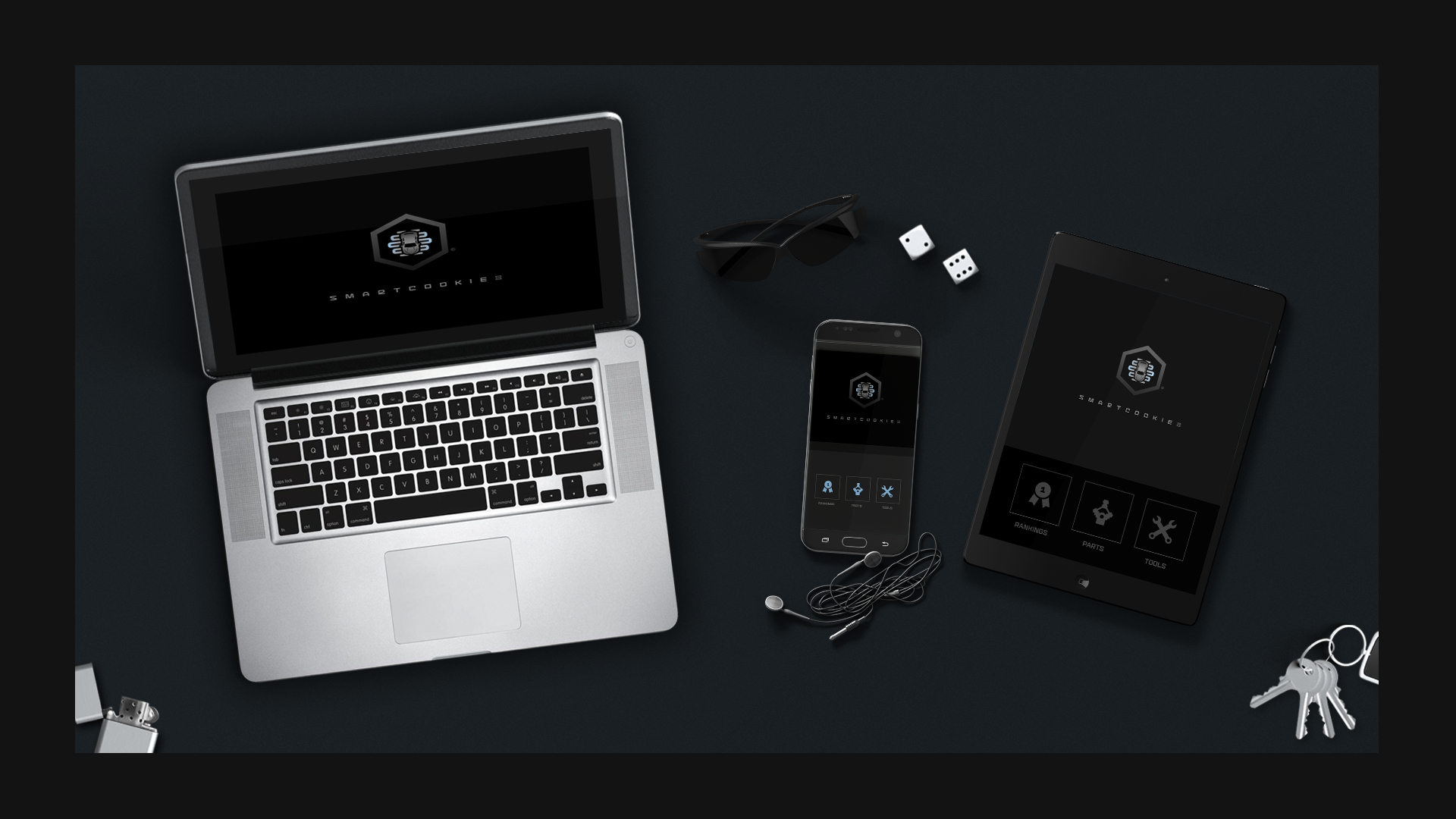
[3-E]
Brand Components
Explorations of the identity within the context of digital devices are portrayed.
![]()
[3-F]
Brand Mark Strategy
The core position and positioning objective combine to drive every element of the identity design:
![]()
[3-G]
Sample Iconography
A system of icons will strengthen the communication level of the overall brand.
![]()
[3-H]
Styleframe 1
Styleframe 1 illustrates an experimental approach to the brand aesthetic.
![]()
[3-I]
Styleframe 2
Styleframe 2 illustrates another experimental approach to the brand aesthetic.
![]()

[3-J]
Styleframe 3
Styleframe 3 illustrates another experimental approach the brand aesthetic.
![]()